My role: Site plan, UI design, Icon design
Holdsworth Foods are a well respected food supplier to caterers. The site was great fun to work on. At the time of the project their existing site wasn't representing the quality of the food they offered or their level of service. There was a lot of work on the visuals to be done. The structure of the site needed some careful thought too.
There were some problems that needed considering from the start:
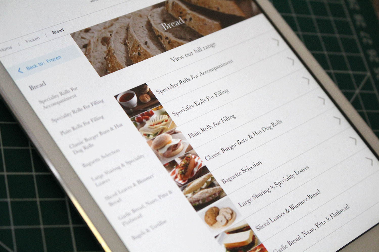
What would be a suitable content structure for 5000+ products (some product categories had only few items in them, others had hundreds) and how would it be possible to have an intricate filtering system to support it?
The target audience would be browsing lots of different products across the site so how could navigating between lots pages of pages be made painless and also retain a sense of positioning in the site?
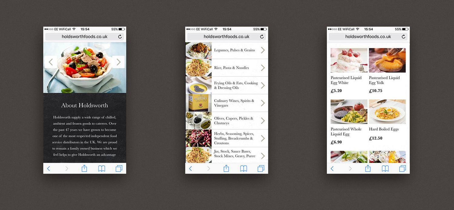
The mobile site needed to retain the same functionality as on a desktop. How to cram all of the above into someone's phone screen?
Designed at Reflow Studio
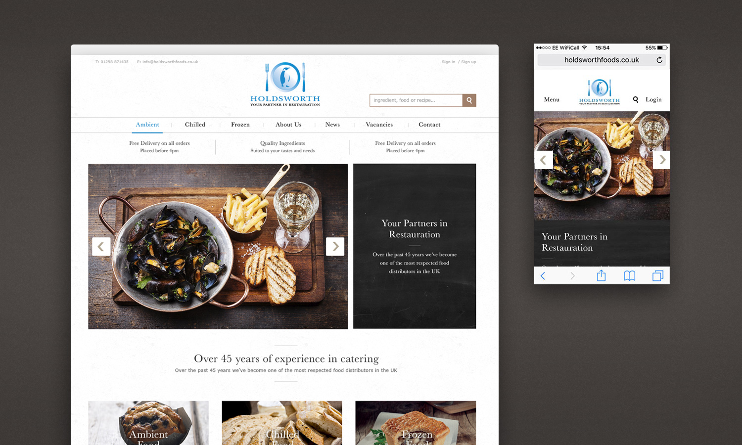
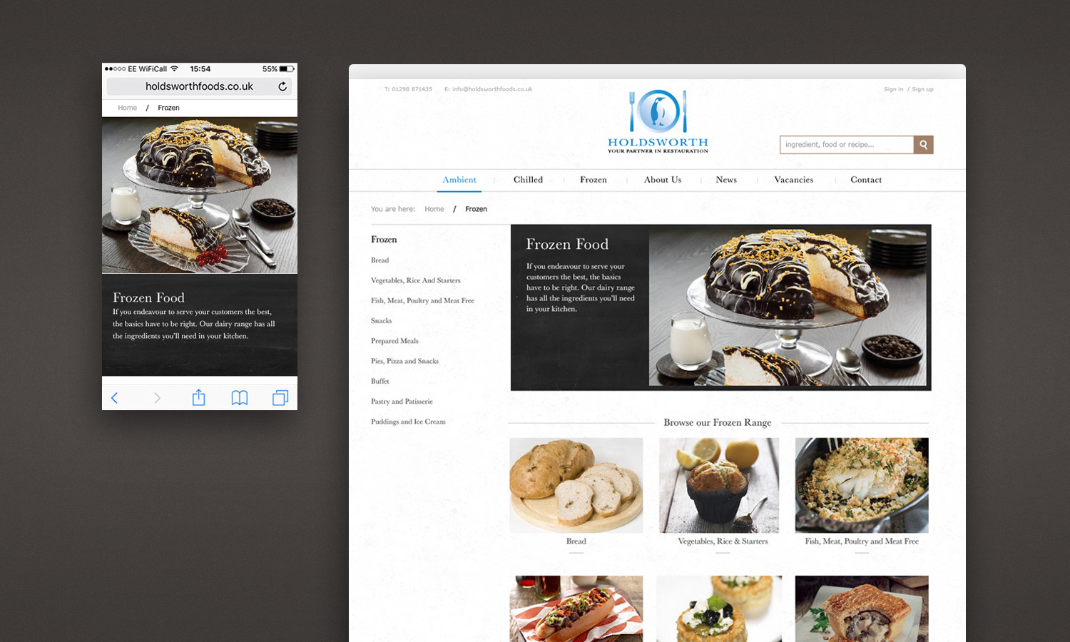
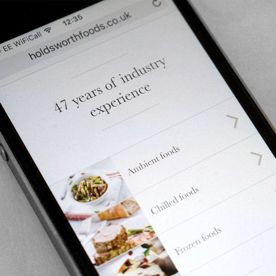
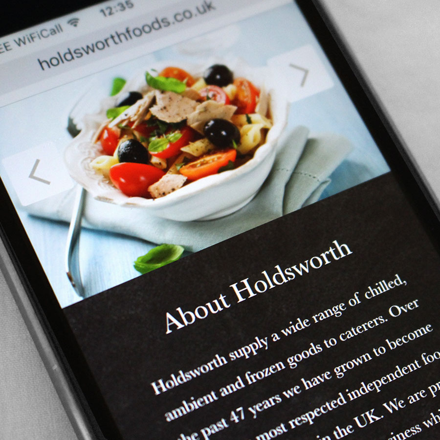
From the early design stages I'd planned and styled the page layout, navigation and product lists to work across as many devices as possible, whilst keeping all of the site's functionality. There are 5 major breakpoints for various handheld devices with smaller components resize depending on the browser/device size.
I carefully considered each page in the early design stages. I wanted to maintain site functionality across all pages and device sizes and to keep the pertinent content towards the top of the screen for ease of use.
I developed the sketches into digital wireframes to present to the client and then into fully formed components to be used by the developer.
On the inner pages I used a product sidebar because of the huge number of products and categories - lots of filters or an expanding menu would be too large and cumbersome. A side navigation alongside product thumbs solves this problem - pictures aren't a problem to scroll through and choose from, a sidebar lists everything from the start in a short space, hassle free.
I used subtle rustic textures, carefully selected photographs, clean custom made nutrition symbols and the classic Baskerville typeface for sites new look.
If you like the sound of working with me then please feel free to get in contact.